Noise · Typographic editorial
A typographic editorial on digital distraction and overstimulation
Notifications, pop-ups, ads and endless scrolling are always competing for attention. What does that feel like if you put it on paper?
- Role
- Visual designer
- Team
- Solo project
- Tools
- Figma, Photoshop, Canva, Illustrator
- Timeline
- December 2025–April 2026
TL;DR
- A typographic editorial that puts the feeling of digital distraction and overstimulation on paper.
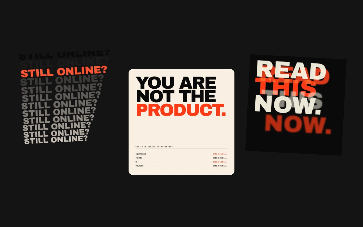
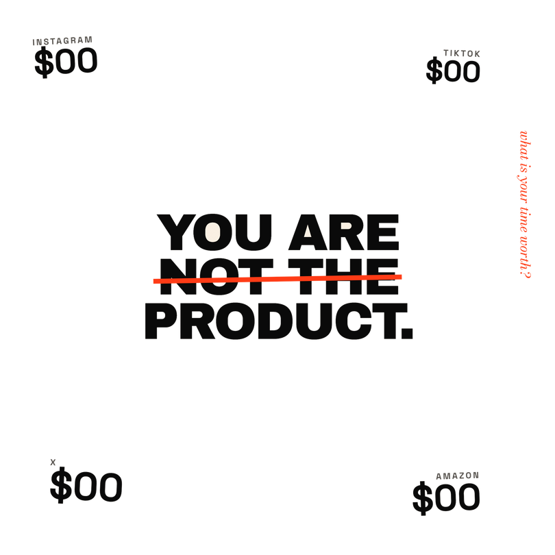
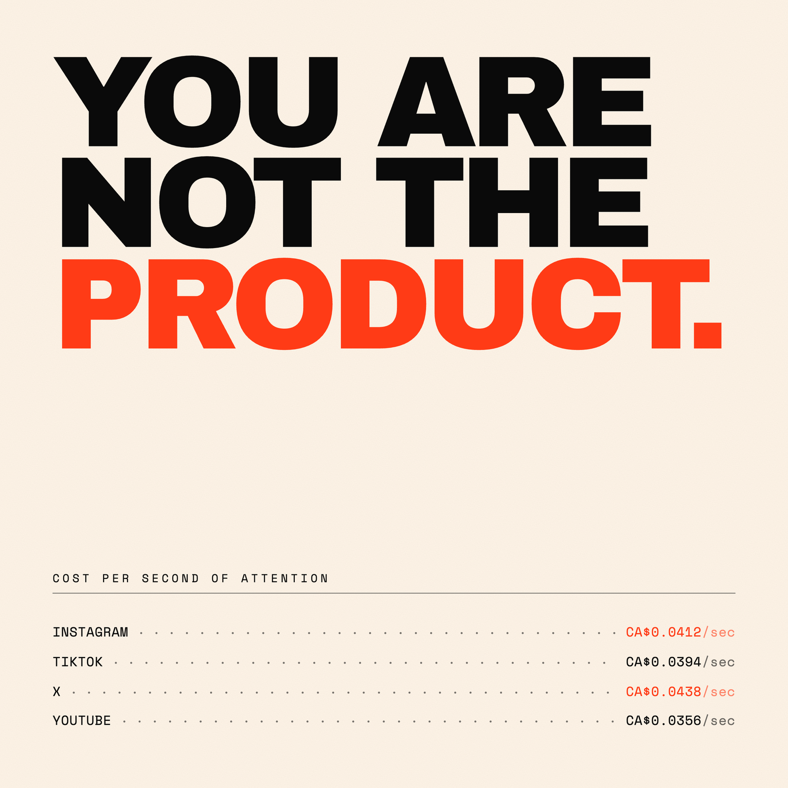
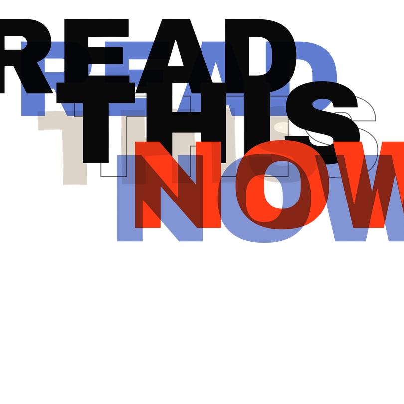
- I pushed three things screens say to us (“Still online?”, “You are not the product.”, “Read this now.”) from plain type to something louder.
- Bold type, repetition and crowded layouts make it feel anxious, while hierarchy, spacing and pacing keep it readable.
The problem
Noise started when I noticed I couldn’t read anything online without being interrupted. Notifications, short videos, unread messages, pop-ups and ads all compete for the same attention, and after a while it’s draining.
Most apps are built to keep you on them as long as possible. In the moment it’s fun, but afterwards you’re tired and not sure why.
I didn’t want to design another app about it. I wanted to make the feeling itself, in print, with type, repetition, contrast, crowded layouts and pacing.
Research: collecting interruptions
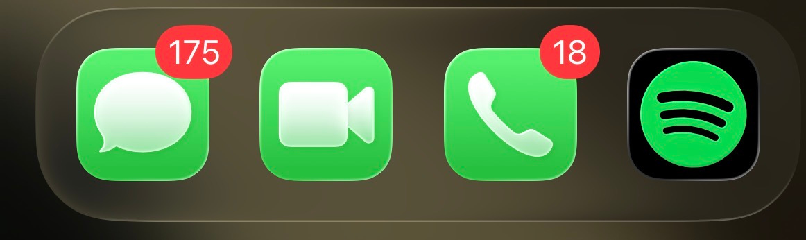
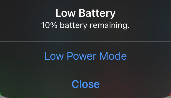
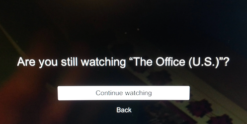
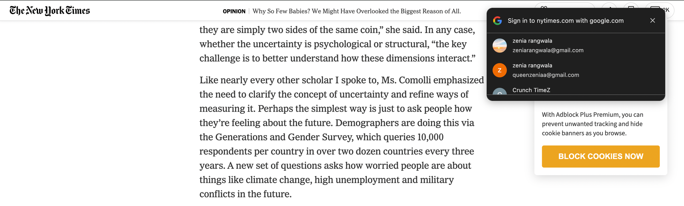
I didn’t realise how often I get interrupted until I started screenshotting every time it happened. Those screenshots became my research, and my source material: the phrases, the badges and the pop-ups all made it into the editorial.
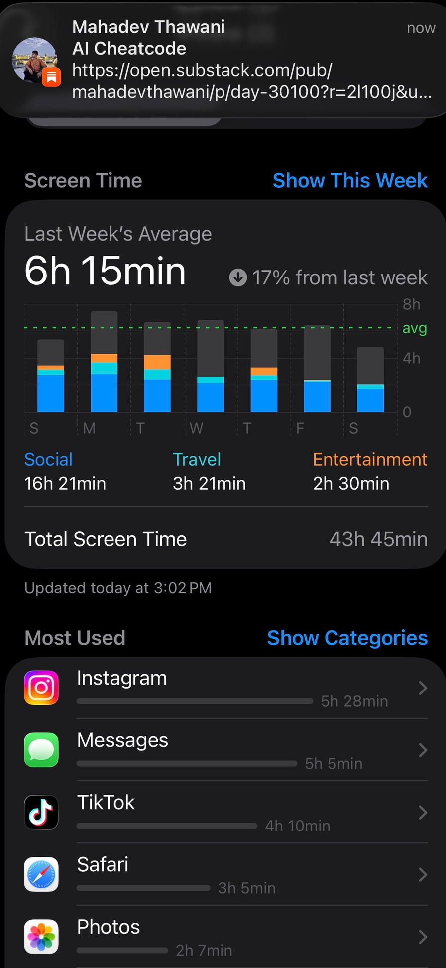
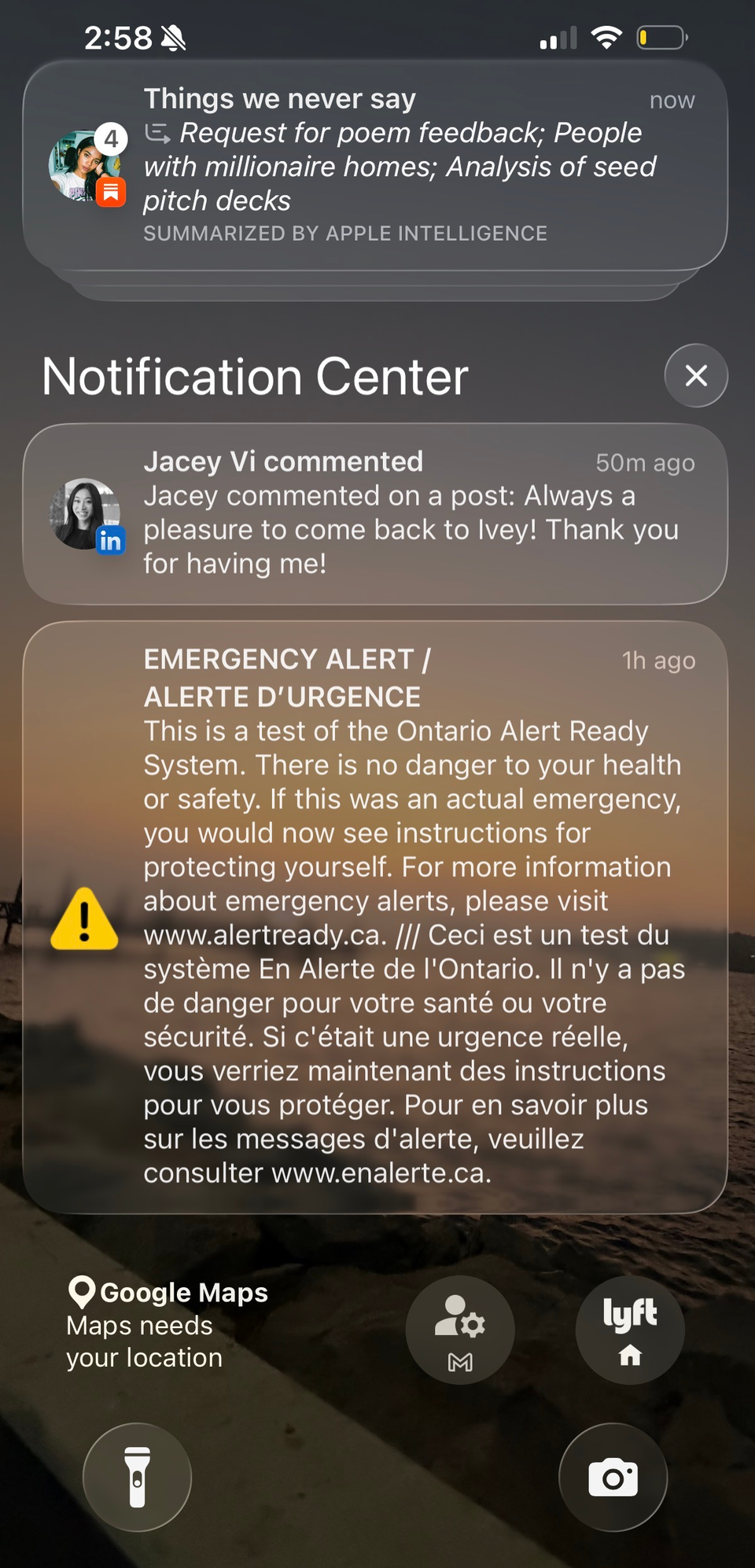
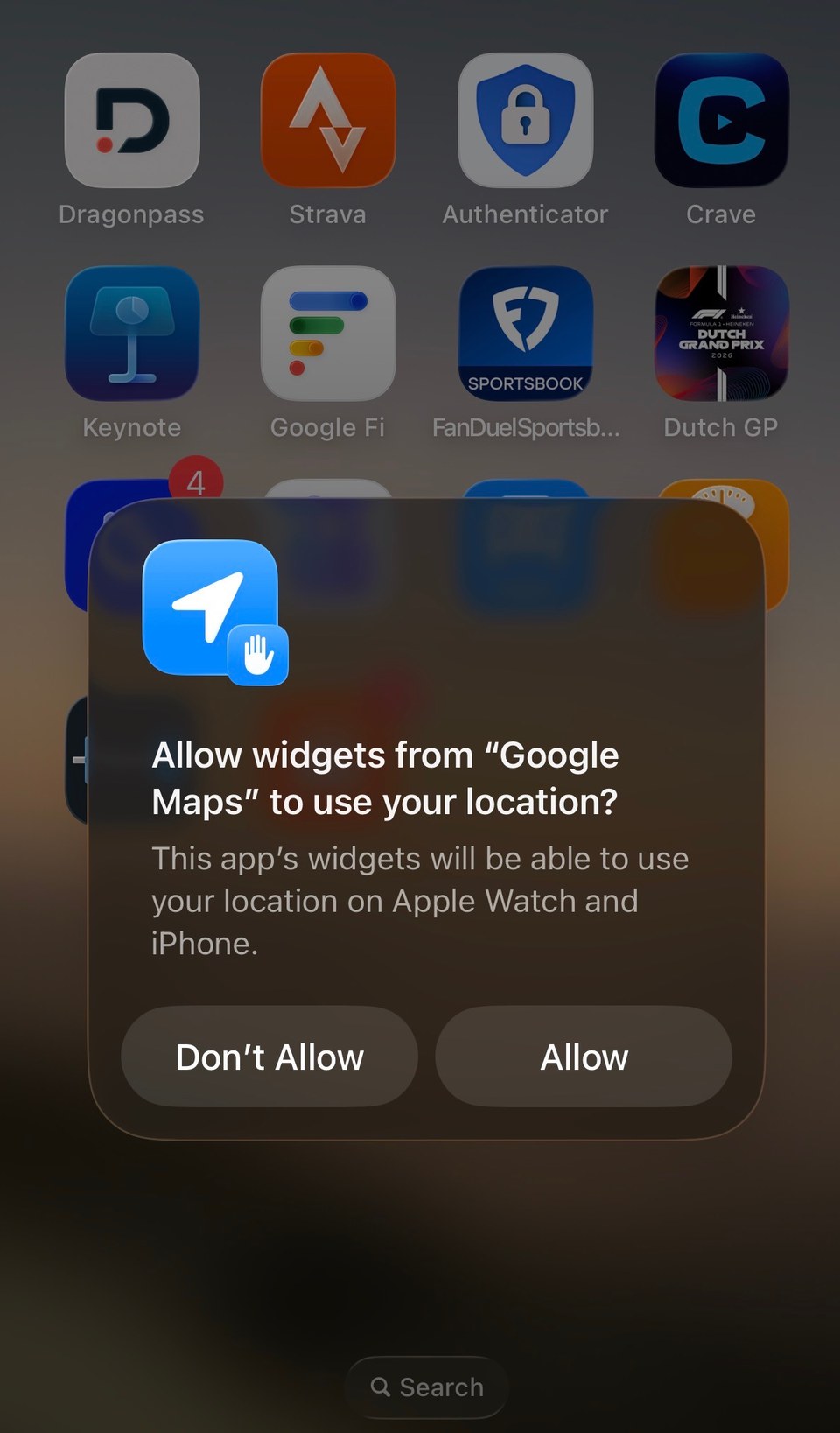

Iteration: three phrases, pushed further each time
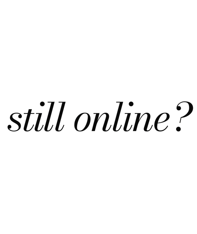
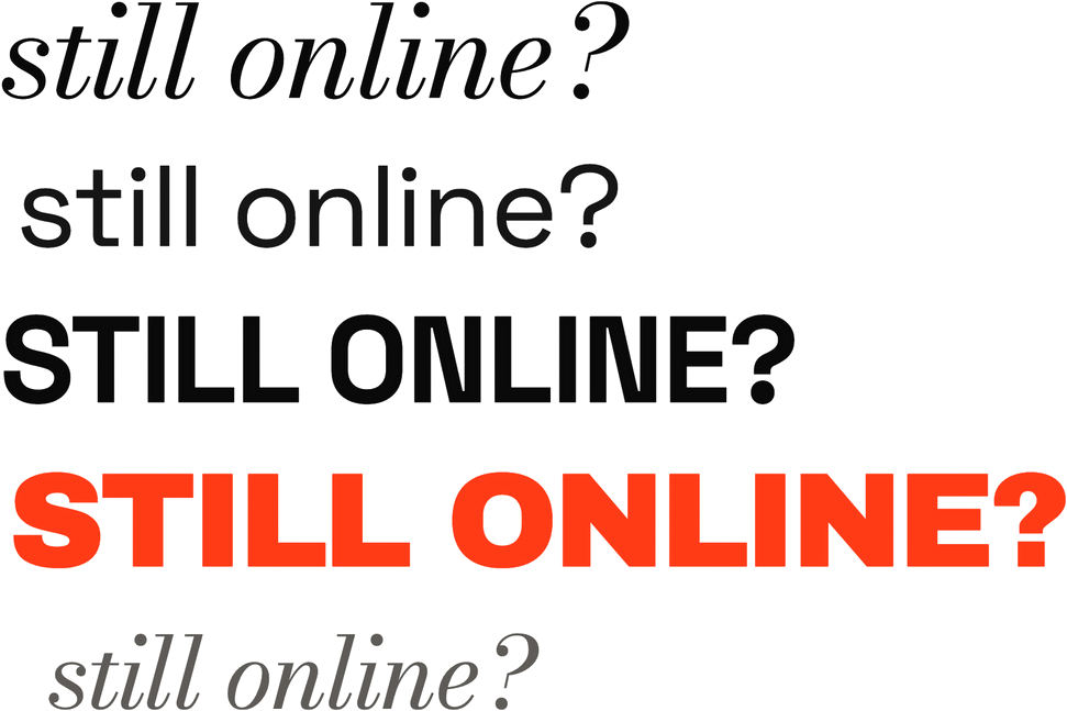
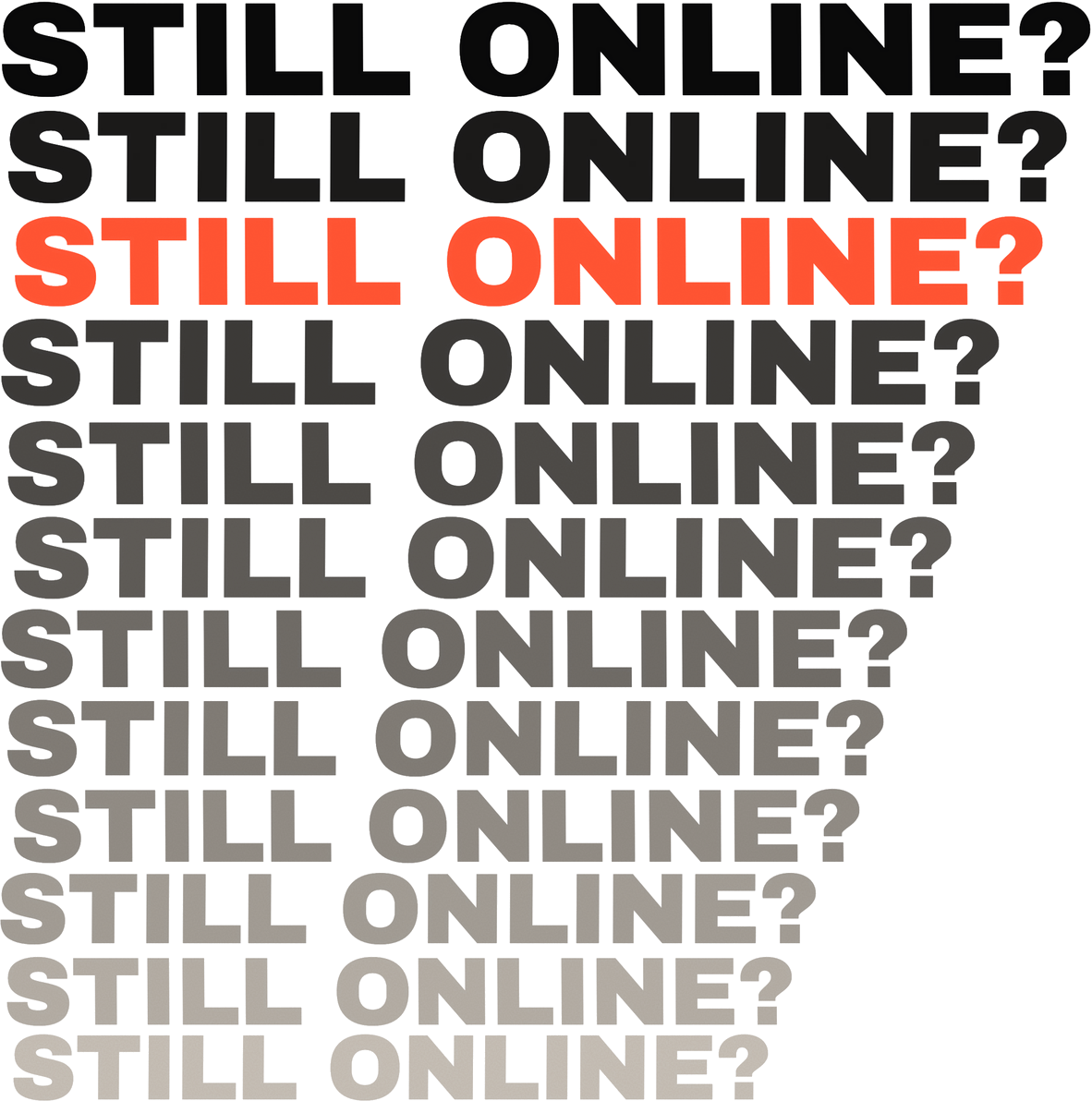
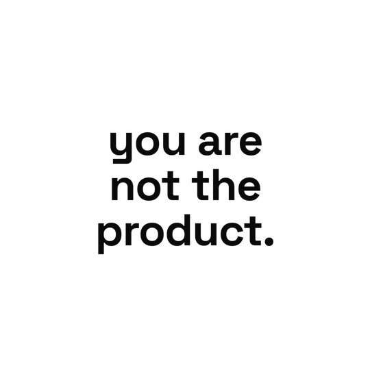
I picked three things screens say to us and pushed each one from plain type to something louder. In every case, plain type alone was too quiet. The feeling only came through once I added repetition, layering, colour or real numbers.
“Still online?”
“You are not the product.”
“Read this now.”


Design decisions
The editorial switches between quiet reading and loud interruption, the way a screen pulls you back and forth without you noticing.
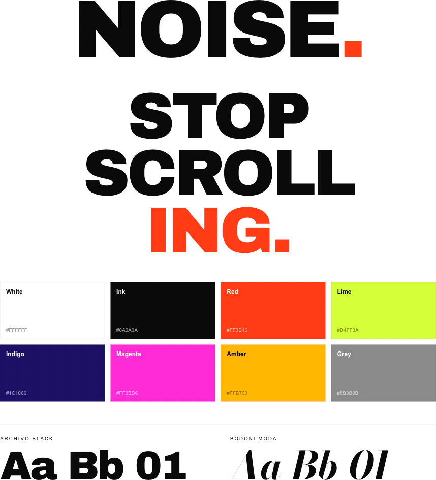
Two typefaces do that job. Archivo Black is the interruption: heavy, urgent, repeated. Bodoni Moda is the slow reading voice. Some pages are meant to be uncomfortable, but hierarchy and spacing still tell you where to look first, so you can always find your way through.
- White #FFFFFF
- Ink #0A0A0A
- Red #FF3B16
- Lime #D4FF3A
- Indigo #1C1066
- Magenta #FF2BD6
- Amber #FFB700
- Grey #8B8B8B
Final editorial
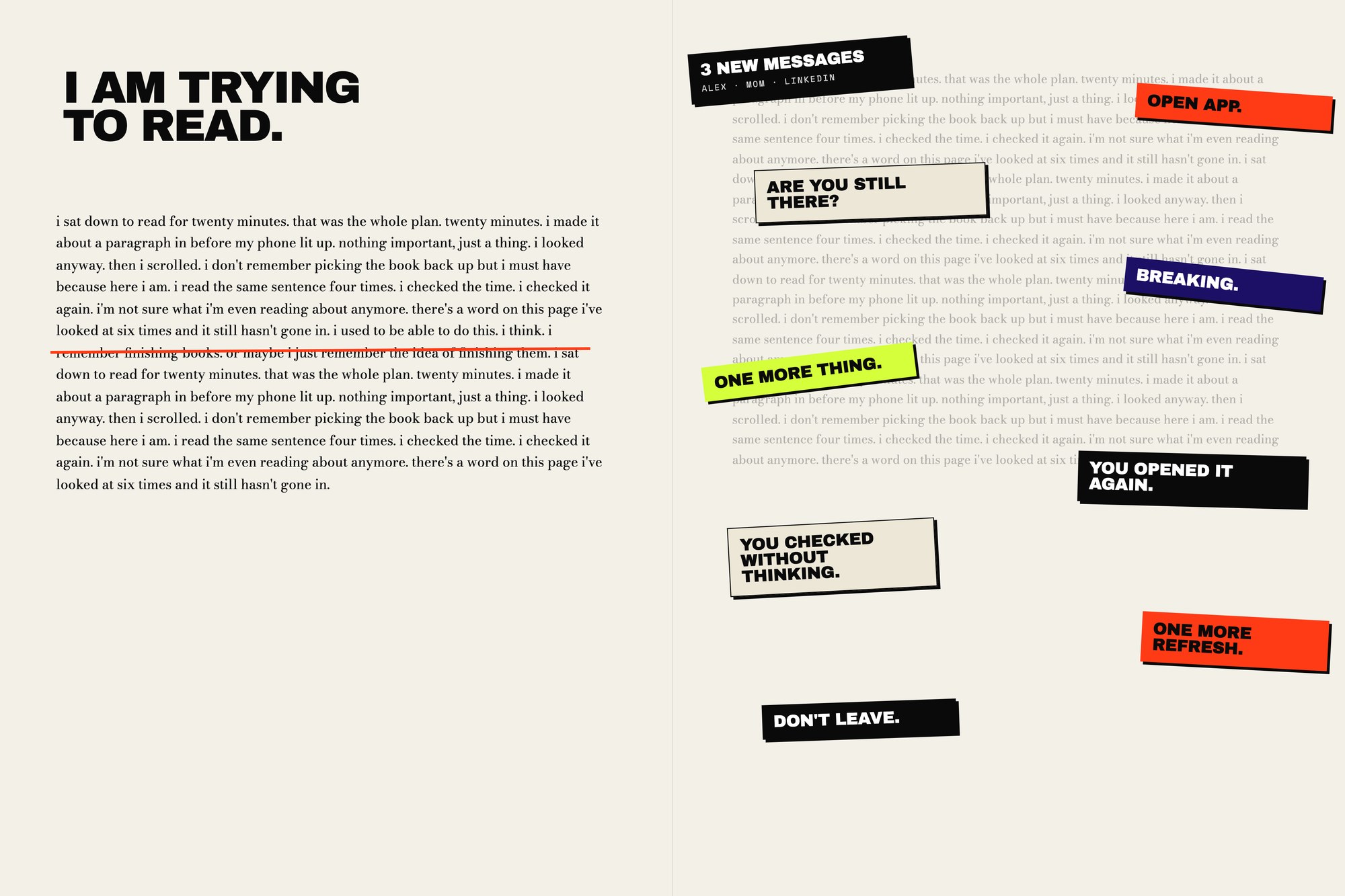
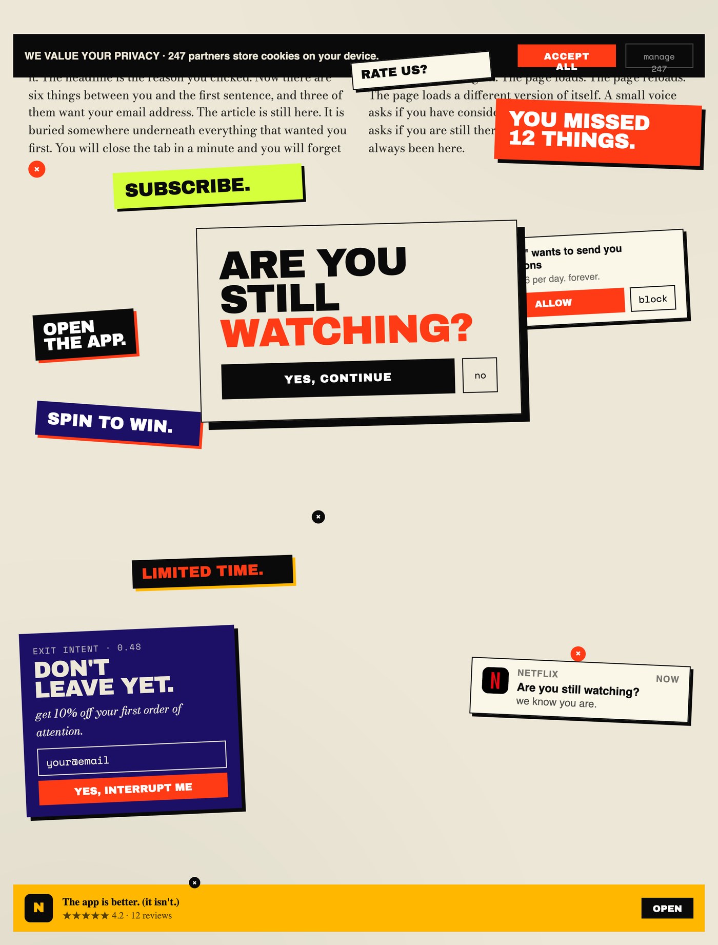
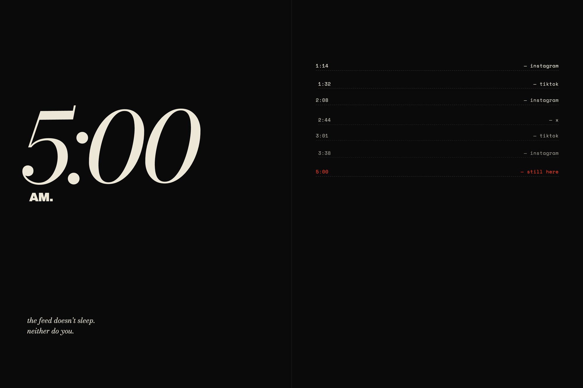
The posters became spreads, where the interruptions get in the way of something you’re trying to read. You feel the problem instead of being told about it.
Takeaways
- Research can be the material. My own screenshots gave me the words, the colours and the rhythm of the piece.
- Type can carry a feeling on its own. Repetition, weight and crowding made the pages feel anxious without a single illustration.
- Uncomfortable still has to be readable. Hierarchy and pacing are what keep the loud pages from turning into actual noise.
Next, I’d test the spreads with readers to find where discomfort tips into people giving up, and pace the quiet pages around that.