Arrival to Approval · Service design · IBM capstone, University of Waterloo
Making Canadian credit make sense for newcomers
Newcomers are expected to understand Canadian credit almost right away, but nobody really teaches them how it works.
- Role
- UX designer
- Team
- Group capstone with IBM, University of Waterloo
- Tools
- Figma, Canva
- Timeline
- January 2025 – April 2025
TL;DR
- An IBM service design capstone: a multilingual platform that helps newcomers to Canada understand credit and build a credit history.
- Research showed two gaps: newcomers are expected to understand credit without being taught, and the help that exists is formal and intimidating.
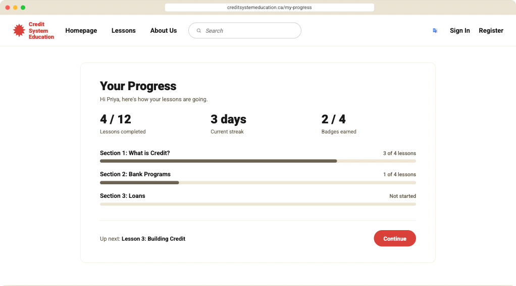
- We designed around Priya, a grad student turned down for housing and a phone plan, and answered with short lessons, guided onboarding, a multilingual AI chat and visible progress.
The problem
This one was personal. I immigrated to Canada too, and I remember how confusing the money side was at first. Credit scores, credit history and what banks expect are treated like common knowledge, and it feels like everyone else learned a system you were never taught.
Without a Canadian credit history, newcomers get turned down for apartments, loans and even phone plans. And most of the resources meant to help are long, formal and written for people who already know the terms.
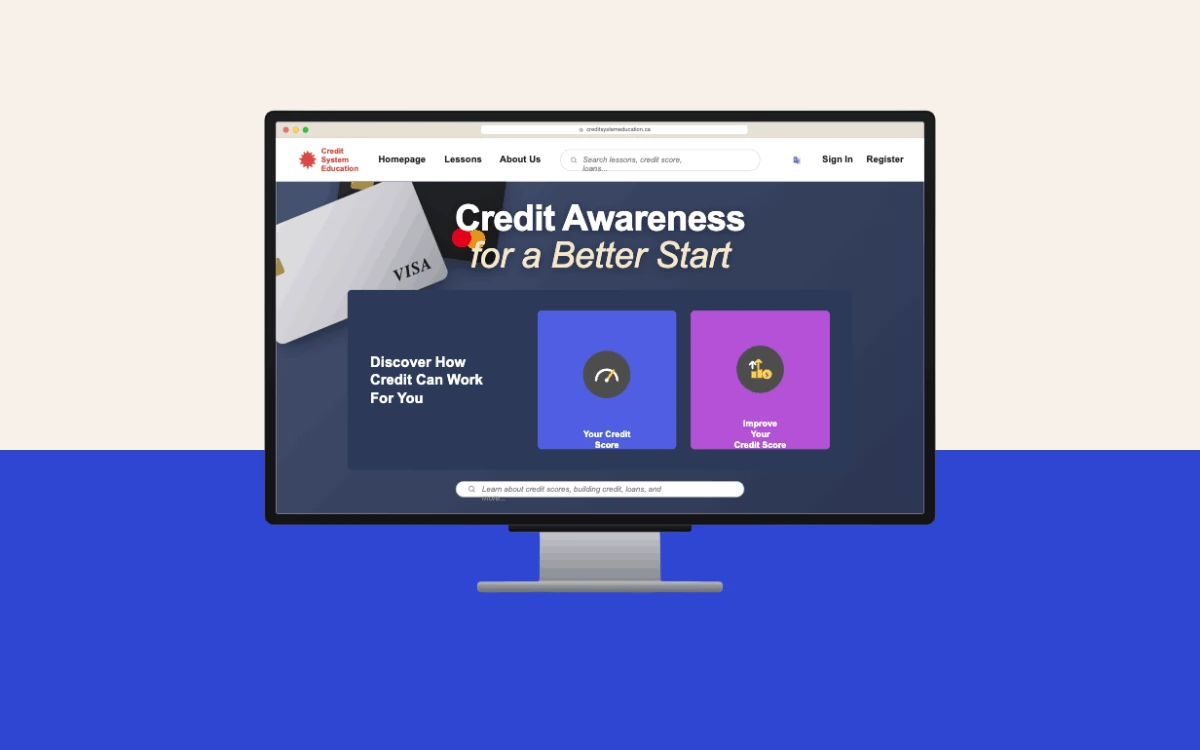
Arrival to Approval was our 4th-year IBM service design capstone: a multilingual learning platform that explains credit in plain language, with an AI chat for anything the lessons don’t cover.
Research and insights
Our research looked at three things: how newcomers make sense of the Canadian financial system, how they build a credit history, and what financial education is already out there for them.
Insight 1: Credit is treated as common knowledge
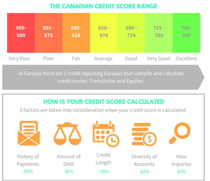
Your score decides where you can live and what you can borrow, but many newcomers arrive without knowing how it’s calculated or why history matters. Most resources assume you already know the banking terms.
What it meant for the design: start from zero. What a score is, who checks it, and what moves it, before anything else.
Insight 2: The help that exists is intimidating
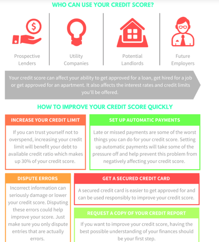
Existing resources lean on long explanations, formal language and information-heavy layouts. When you’re already adjusting to a new country, that makes learning stressful and hard to follow.
What it meant for the design: smaller lessons, conversational language, and AI guidance available throughout instead of a wall of text.
Persona: Priya
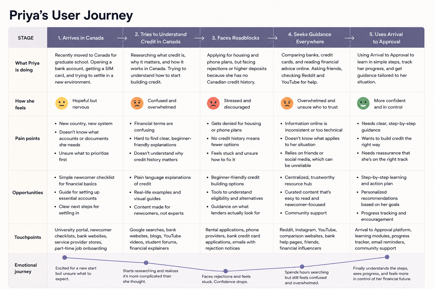
Recently moved to Canada for graduate school. She has savings and a part-time job, but no Canadian credit score, so she keeps getting turned down for housing and phone plans.
- Frustrated by: comparing banks and cards, and advice written for people who already know the system.
- Currently relies on: friends, Reddit and social media, because she doesn’t know where to start.
- Wants: to feel financially confident while building a stable life here.
We mapped her first months, from landing to feeling in control.
From research to design principles
| Research finding | Design principle | How it shows up |
|---|---|---|
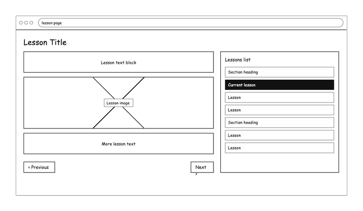
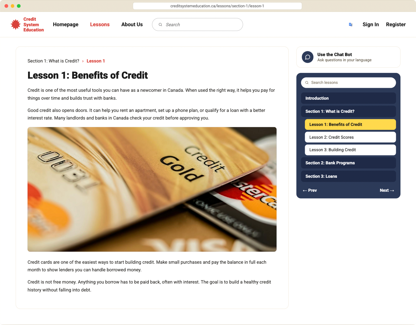
| Financial information felt too formal and overwhelming | Make it easier to understand | Short lessons, one idea each, with a Next button |
| Platforms assume users already understand the system | Make it feel supportive | Guided onboarding that starts with “what is a credit score?” |
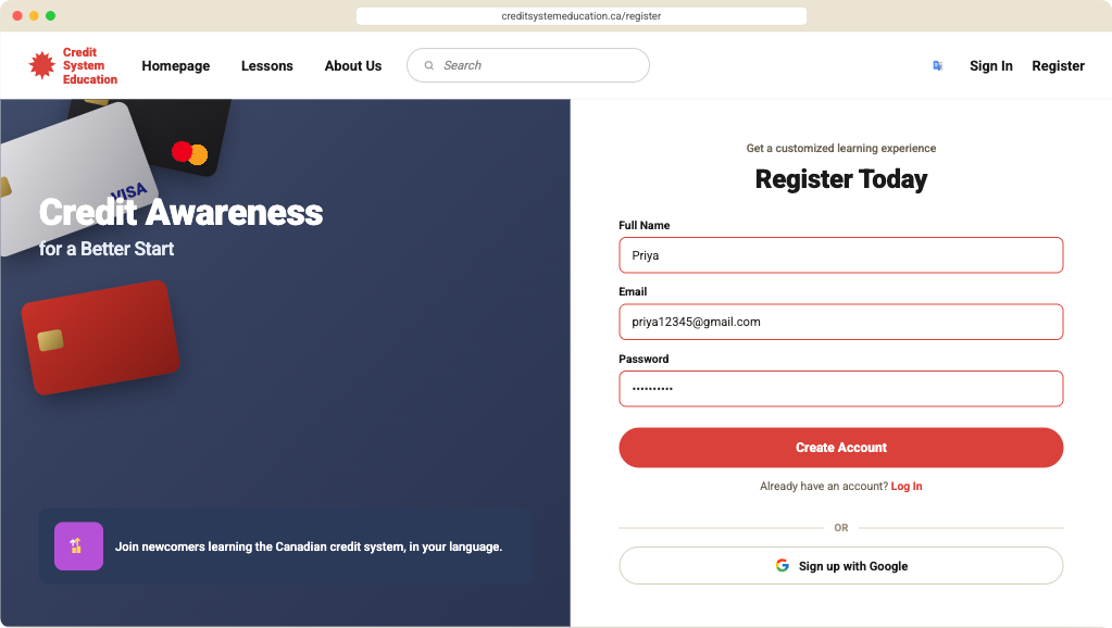
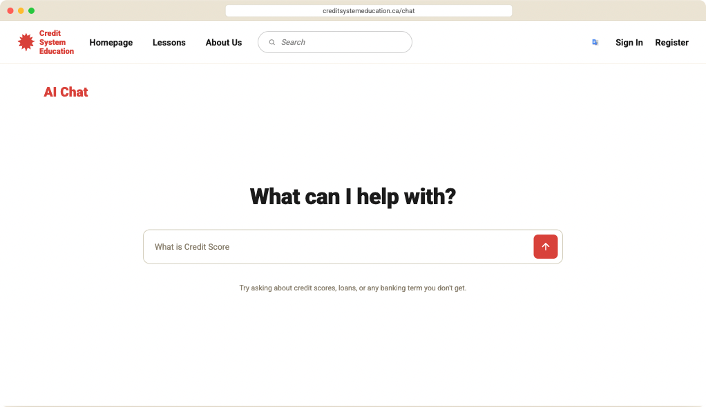
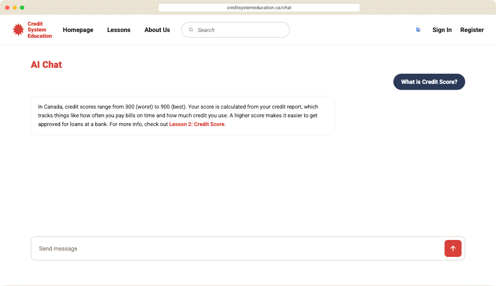
| Newcomers come from many backgrounds and languages | Accessibility and language | “In your language” on sign-up, and a chat that answers in the language you ask in |
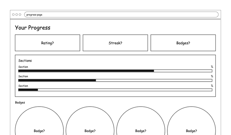
| Priya’s confidence only returned once she saw progress | Help users feel progress | Lessons completed, streaks and badges, with what’s next always visible |
User flow
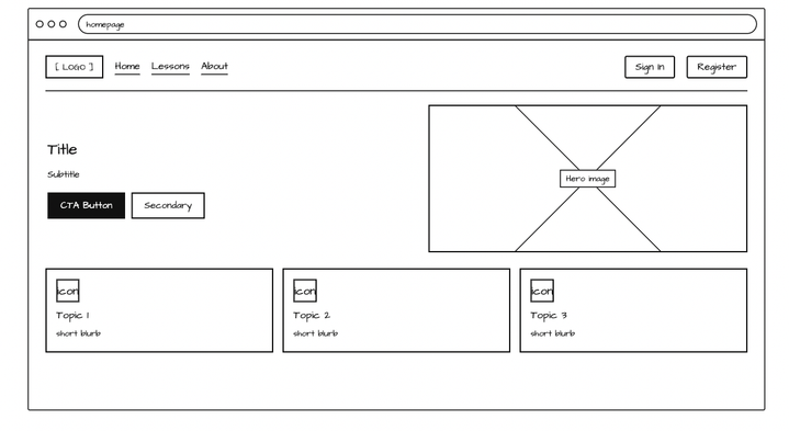
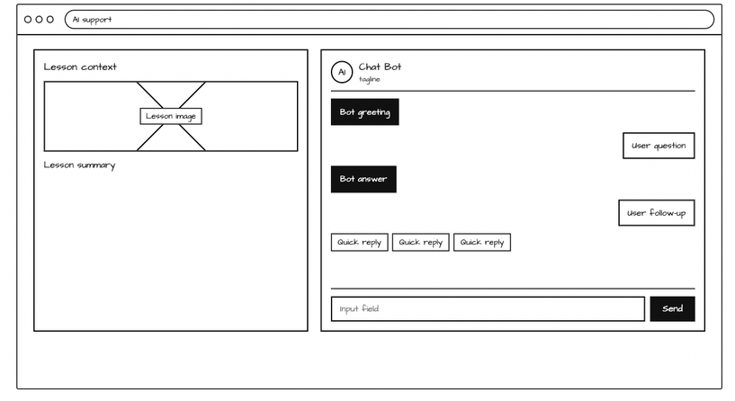
Four main screens: a dashboard, lessons, the AI chat and progress. We wireframed them before any visual design.
High-fidelity mockups
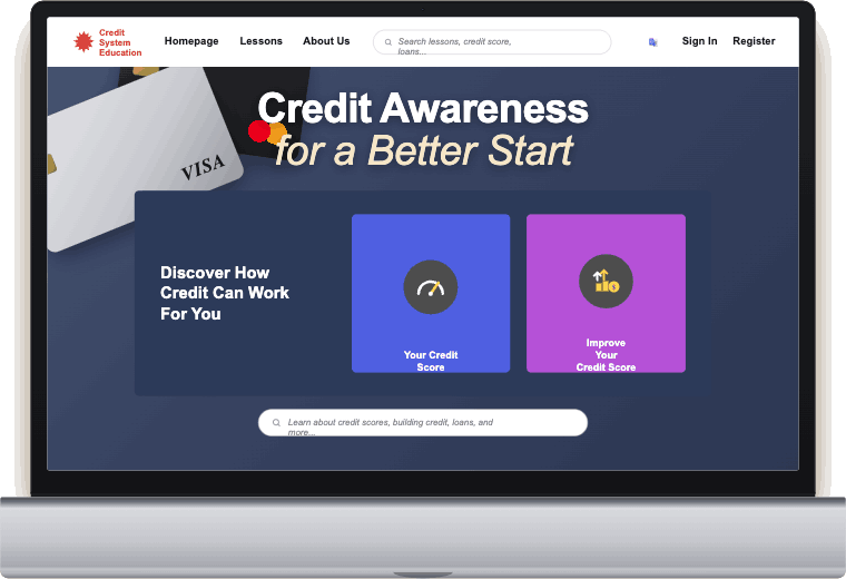
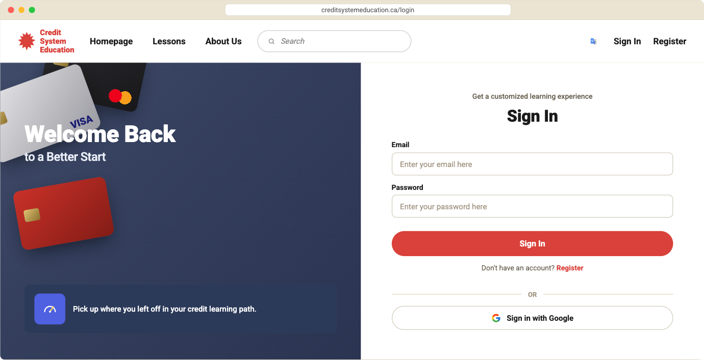
The chat is one click away from every lesson, so you can ask about a word the moment you hit it. Answers stay short and link back to the matching lesson.
Takeaways
- Research earns its place when it changes the design. Each principle traces back to something we found, so no feature is there just because it seemed nice.
- Plain language is a design decision. The hardest part wasn’t the layout. It was explaining credit without the jargon that shuts newcomers out.
- This one was personal. Having gone through it myself helped me see exactly where the existing resources lose people.
Next, I’d test the lessons and the AI chat with recent newcomers, to see whether short lessons actually build enough confidence to apply for a first card.