Greyhound · Brand identity and strategy · Student concept (GDVX 502, Big Brand Rebrand)
Rebranding the bus for the people who actually ride it
How can Greyhound keep its history and prices, but feel like a trip people actually want to take?
- Role
- Brand designer
- Team
- Solo project
- Tools
- Illustrator, Canva, Photoshop
- Timeline
- Fall 2026
TL;DR
- Greyhound is known as “the cheap bus”. I repositioned it around the one thing no competitor owns: the ride itself.
- I kept the running dog and the low prices, and rebuilt colour, type and a region-by-region pattern system around the American road trip.
- Three rounds of critique turned an airline-style first draft into 13 components for one trip from Atlanta to New York, from a print-at-home ticket to kids' colouring books.
The problem
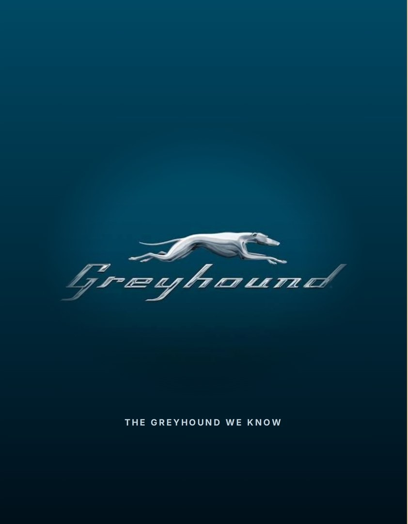
Greyhound has moved people across America since 1914, and its whole promise is cheap long-distance travel. The chrome dog and script wordmark are everywhere, but the brand feels old, grey and “cheap bus”.
Research
Who rides. Mostly young adults (18–24) and seniors (65+) on low to middle incomes who need to travel far for cheap. I turned that into three personas:
- Aditi, 21, a student who needs a trip that fits her budget and is easy to figure out.
- Liam, 28, a solo traveller who wants the trip to feel worth taking.
- Mariana, 38, a mom who needs travelling with her kids to feel simple and dependable.
The competition. Megabus is cheaper but has no stations, so you wait on the curb. Peter Pan is cleaner but only on the East Coast. Amtrak is comfortable but costs much more. Every one of them is selling a seat.
The insight. Nobody owns the experience of the ride. My SWOT pointed to the same opportunity: make the journey itself part of the product.
Strategy
| Old story | New story |
|---|---|
| The cheap way to get there | A way to go somewhere |
| Affordable | Accessible |
| Basic | Spontaneous |
| A bus ride | A road trip |
The big idea became every journey has a story, built on the American road trip people already daydream about. My first moodboard (sage, burnt orange, maps) felt flat. Open roads, desert, coastline, bus windows at sunset and Route 66 are where it clicked.
Identity
One rule from the start: don’t change the dog. It was the most recognisable thing Greyhound had.
Logo: three tries
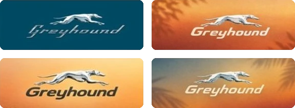
- Chrome dog on sunsets. Still looked like the old brand.
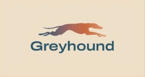
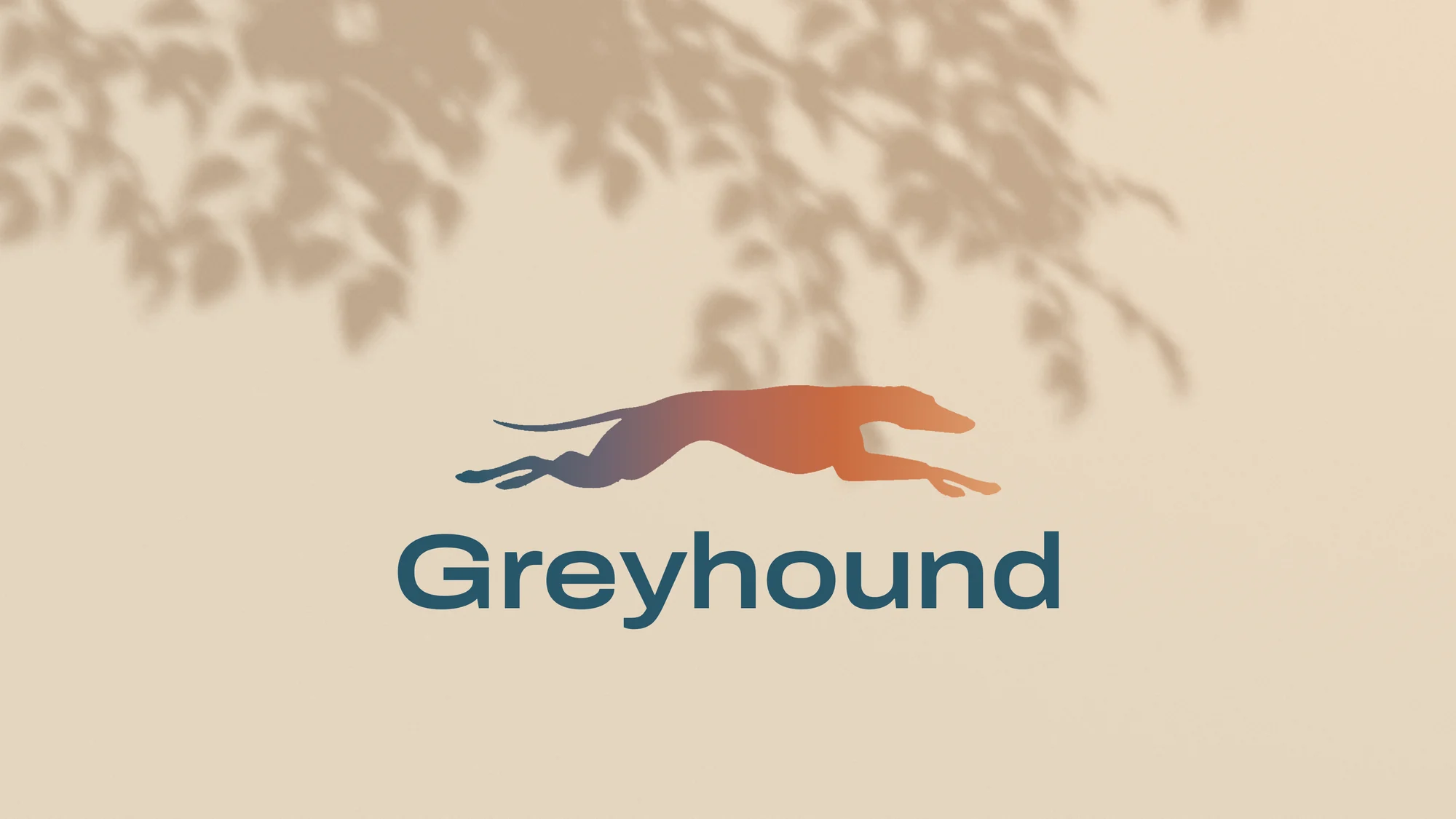
- Gradient dog. The dog in a blue-to-orange sunset gradient, with a blue wordmark.
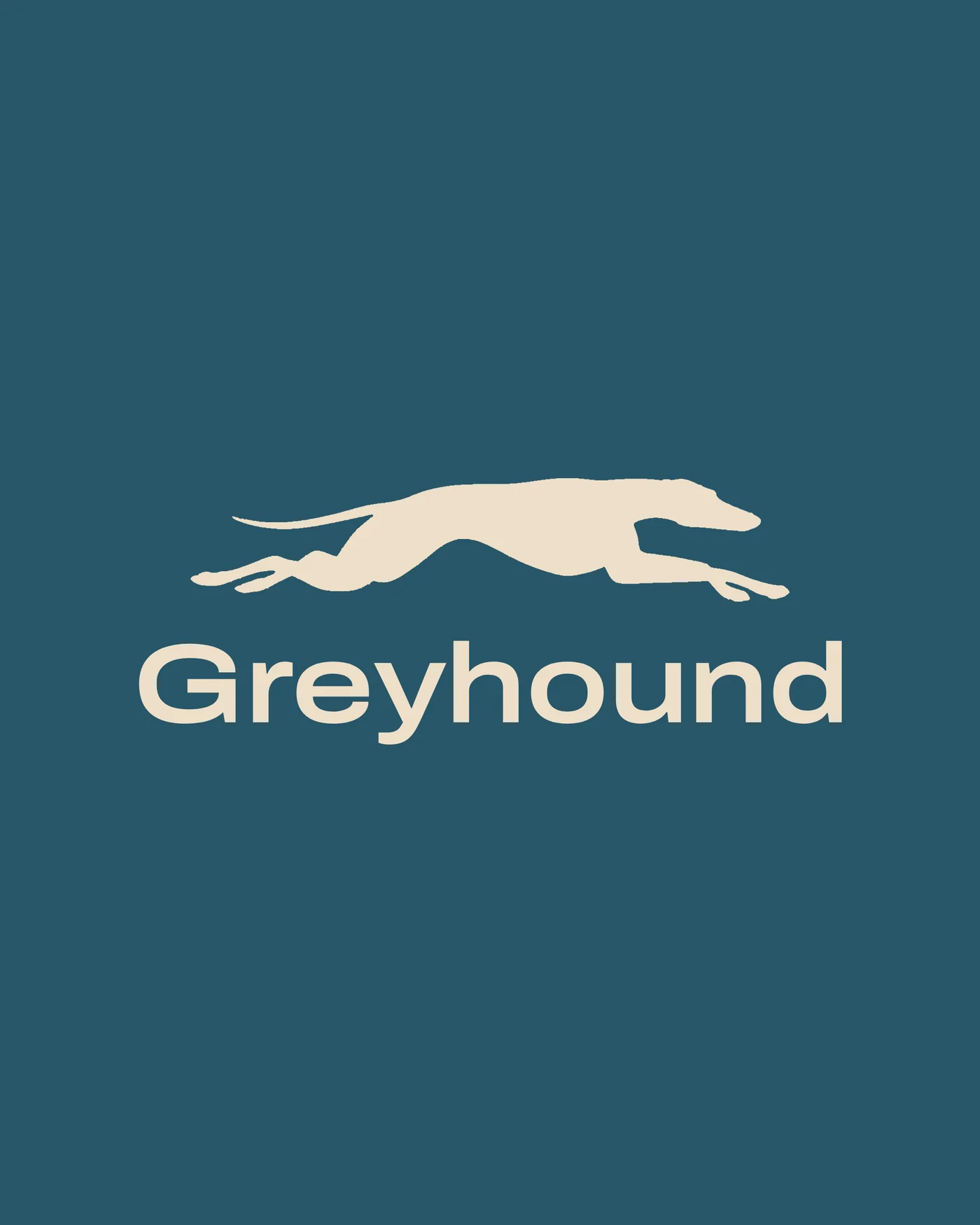
- Final. A cream dog and new wordmark on Majestic Mountain Blue. Simpler, warmer, and it works on everything, including the dog on its own as an icon.

Type: steady, not fast
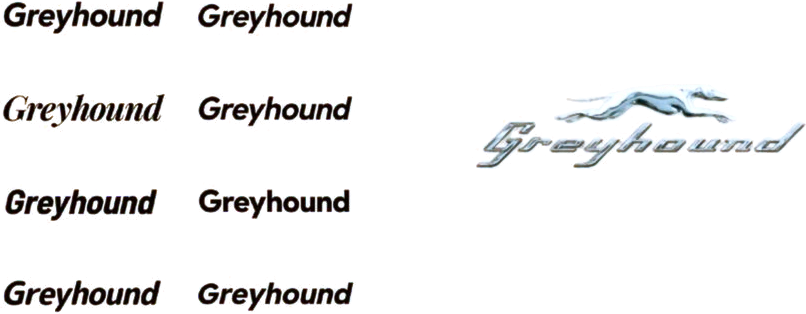
I tested italic and sporty sans serifs against the old script. The italics read as a sports brand. I wanted something wide and steady, like a bus on the highway.
Final wordmark
- Headings
- Archivo Expanded SemiBold: wide and steady, and still friendly next to the dog.
- Body
- Inter, so everything is easy to read on tickets and phones.
Colour: a palette that follows the trip
Version 1 had generic names, and Road Grey felt dull.
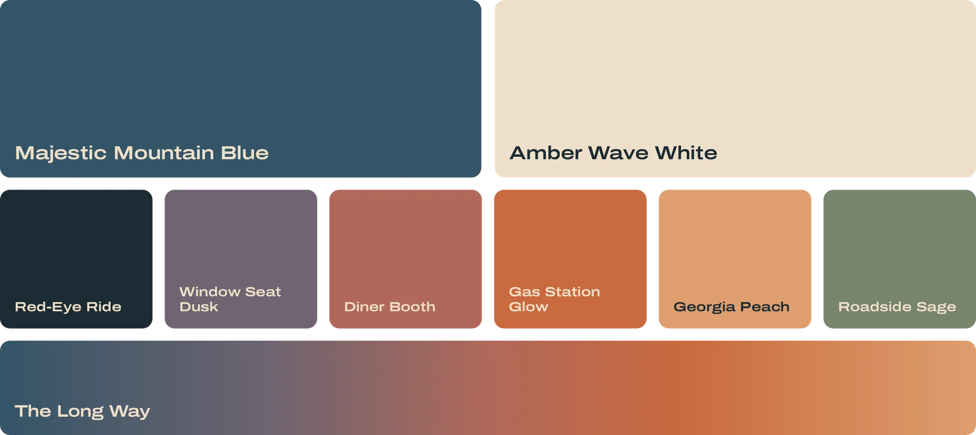
- Heritage Blue #28576B
- Sunset Orange #CA6B3F
- Sand #EEDFC8
- Sage Green #77836B
- Road Grey #393B3A
I cut Road Grey, renamed every colour after a moment on the road, from the Red-Eye Ride to the Georgia Peach, and added a sunset gradient called The Long Way.
System
From generic to regional
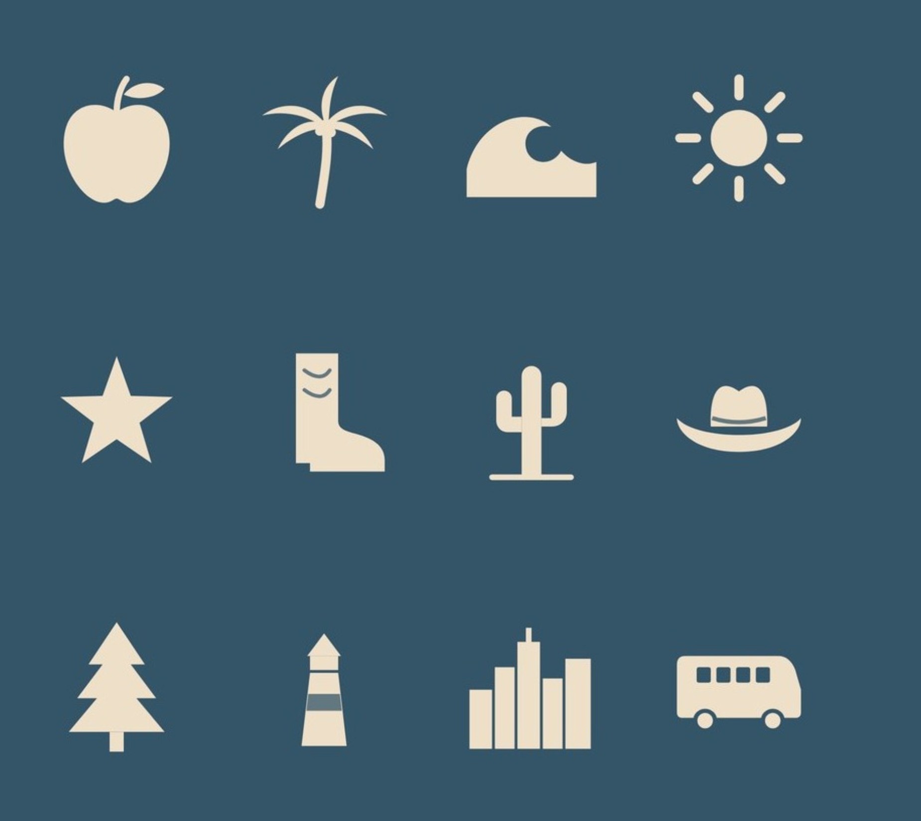
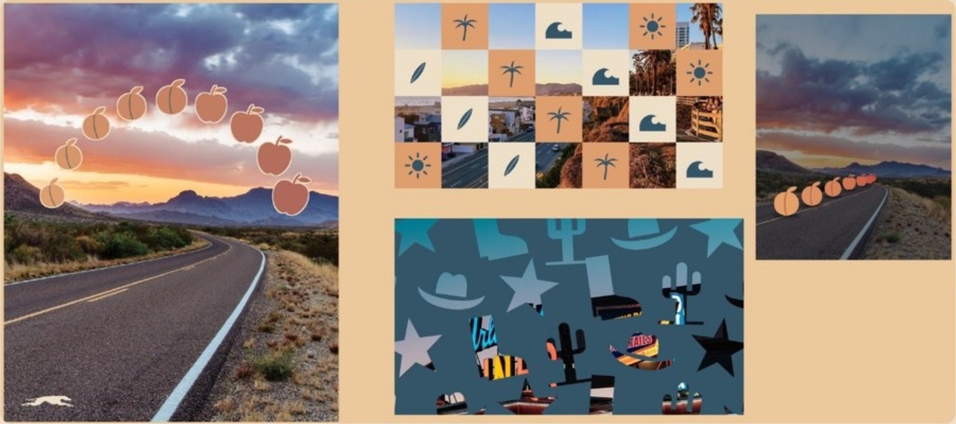
My first pattern was soft leaf shadows. They were pretty, but they could belong to any brand. Critique pushed me toward symbols that tell you where you are: peaches for Georgia, boots and cacti for Texas, palms for the coast.
Pattern and photo together
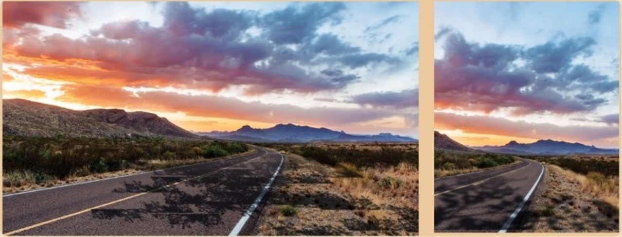
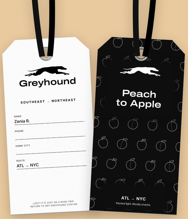
At first the pattern sat faintly on the photo and you could barely see it. I removed the borders and side panels, put the pattern straight onto the photography and let each region look different. I also made the logo bigger against the image, and sometimes used just the dog.
Iteration: the ticket, three times
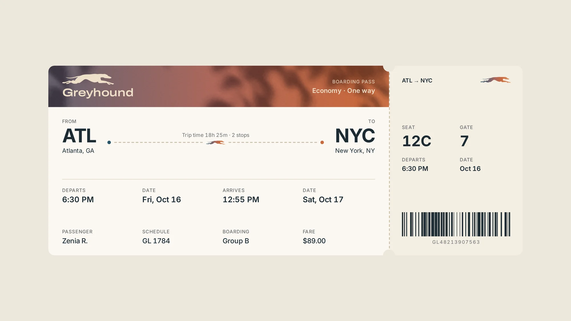
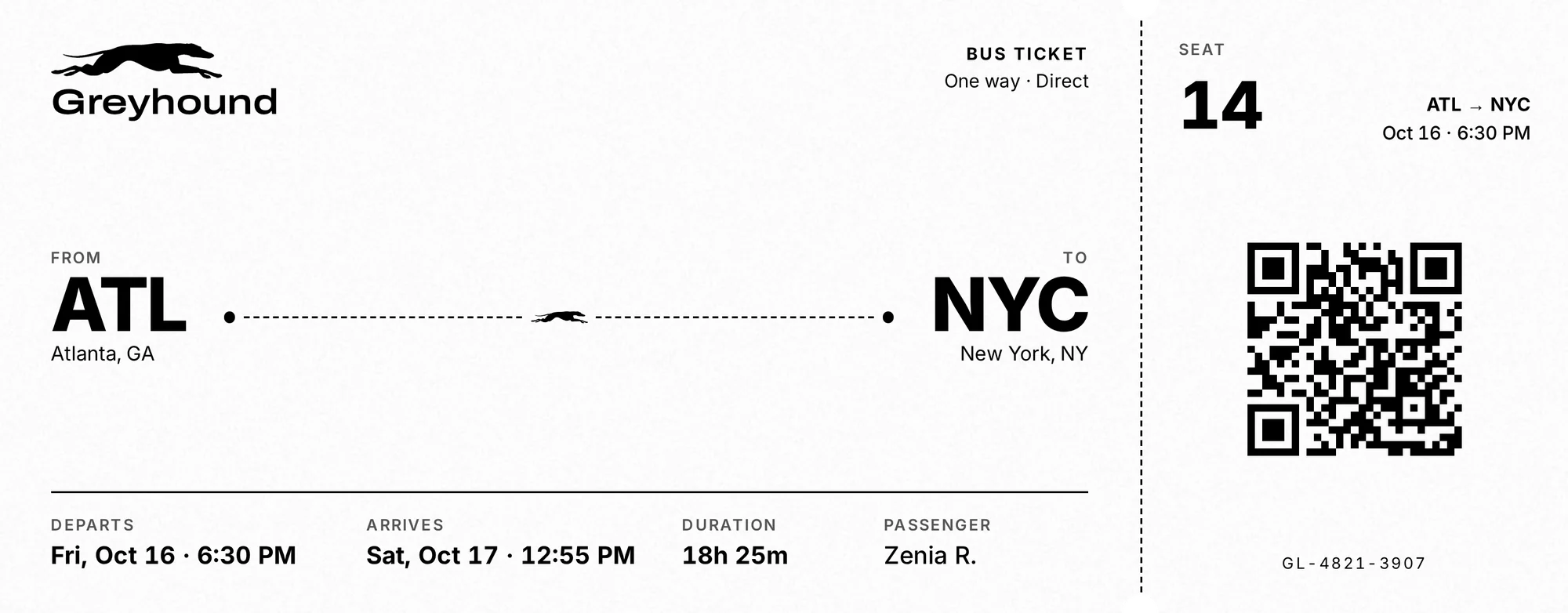
My first round of components (a road card, a stamp card, a boarding pass and an Instagram post) looked like an airline. Critique gave me five notes that shaped everything after:
- It’s a bus, not a plane. No gates, no boarding pass.
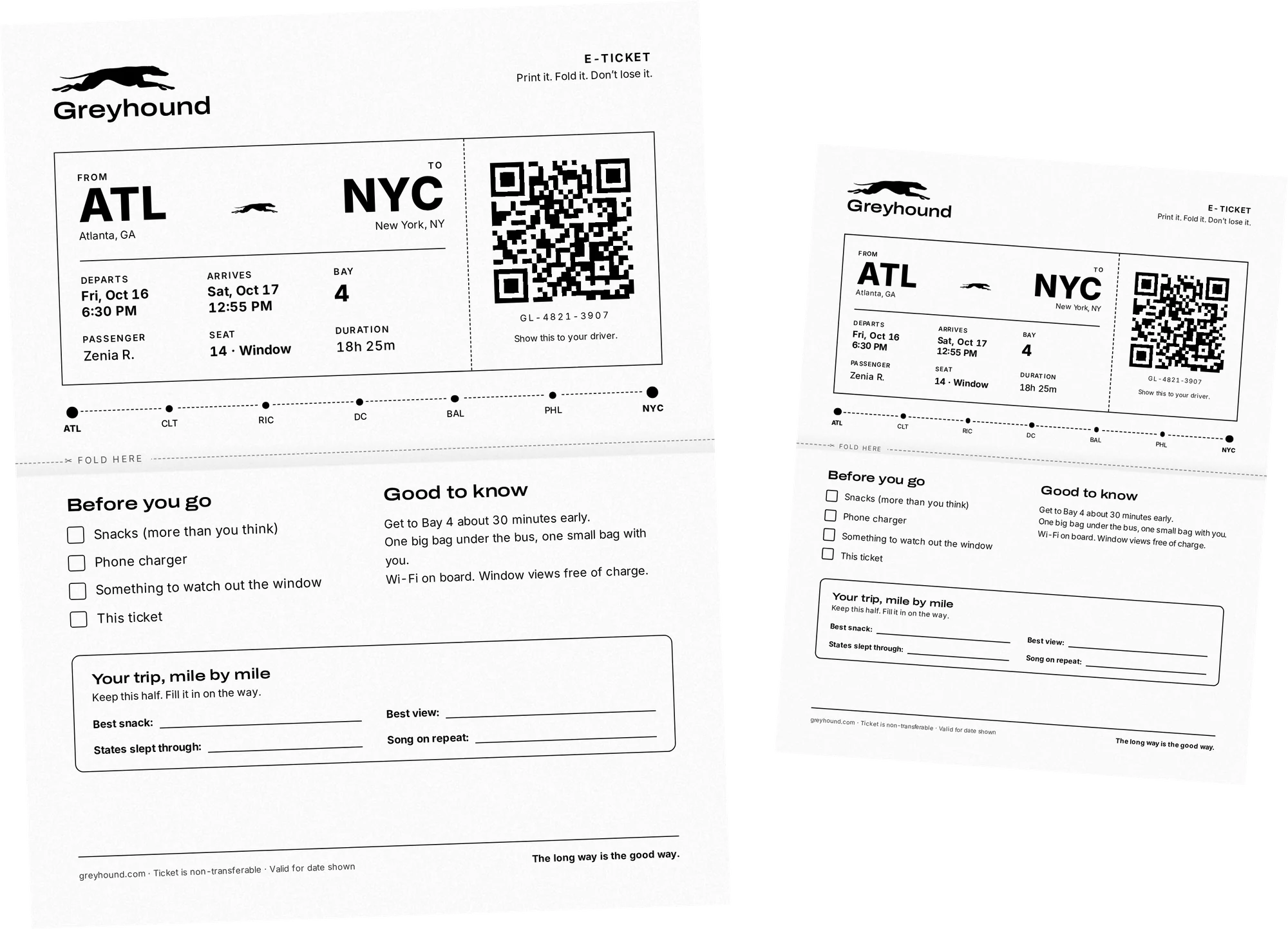
- Make the printed ticket real: black and white, letter size.
- Fewer words, no fake drop shadows.
- Put the brand voice in everything.
- Design for Mariana too, the mom travelling with kids.
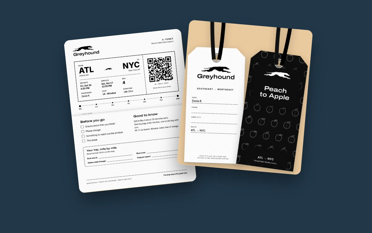
The ticket shows that shift most clearly.
Final design: one trip, 13 touchpoints
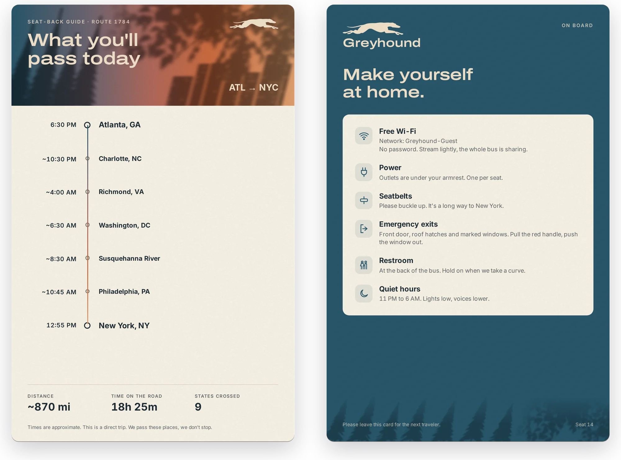
Every component follows one rider from Atlanta to New York, so the system is tested on a real journey rather than a set of mockups.
- Print-at-home ticket
- Wallet pass
- Luggage tag
- Window Seat Guide
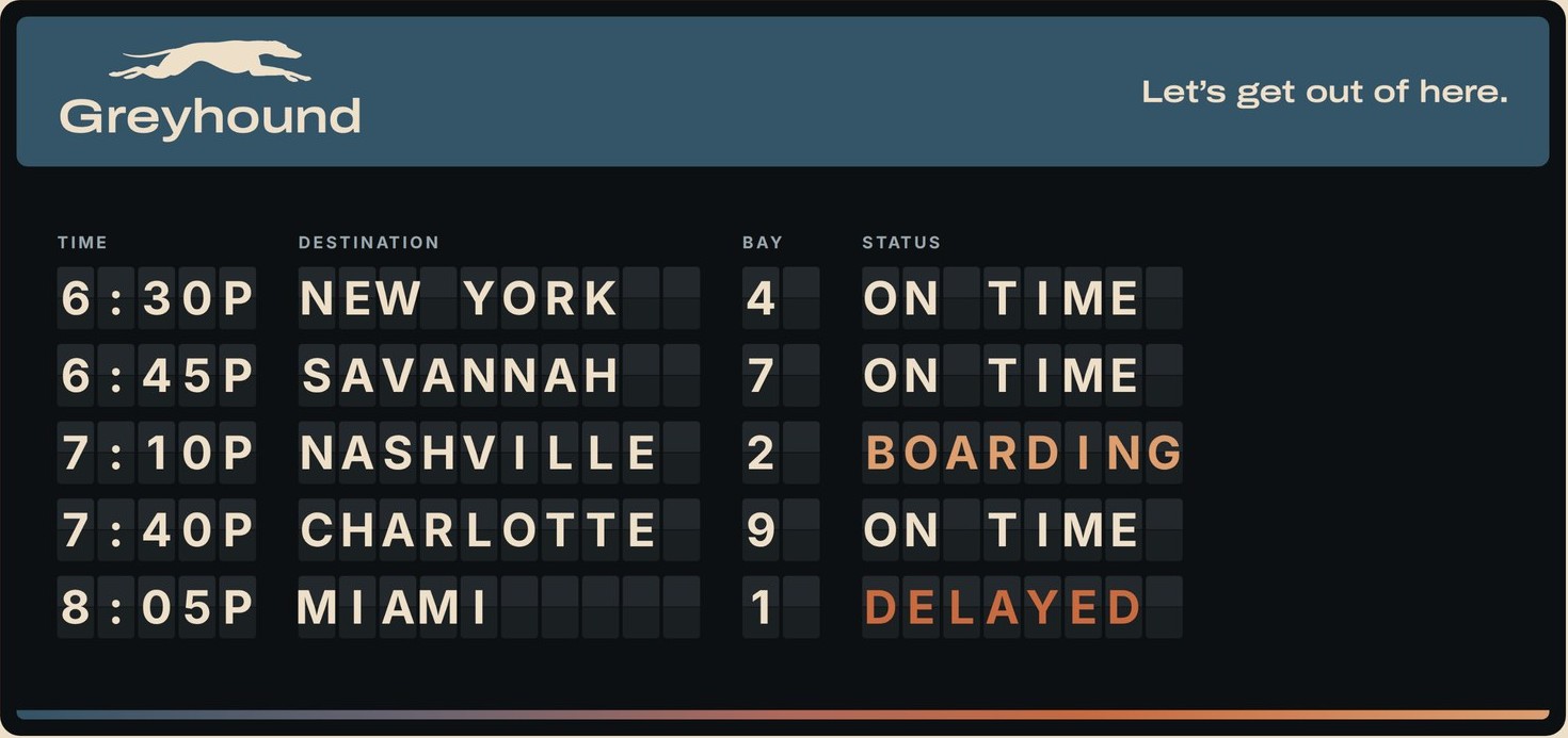
- Departure board
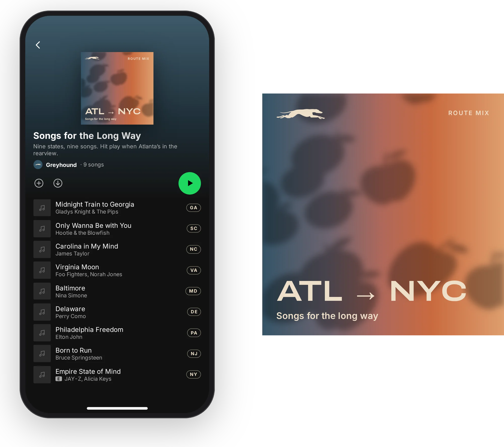
- Songs for the Long Way
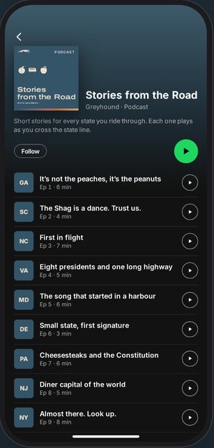
- Stories from the Road
- Sleep kit
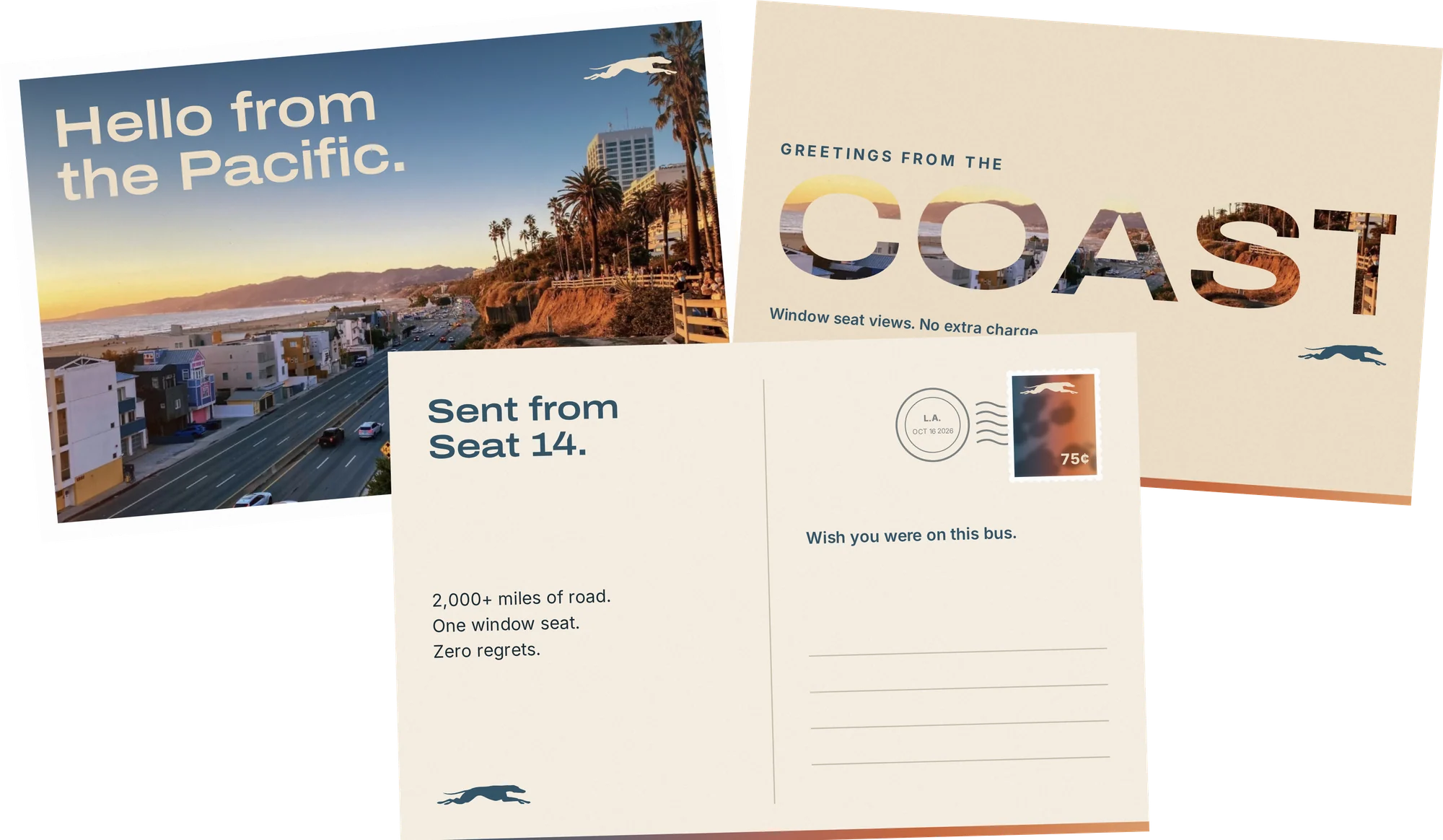
- Postcards
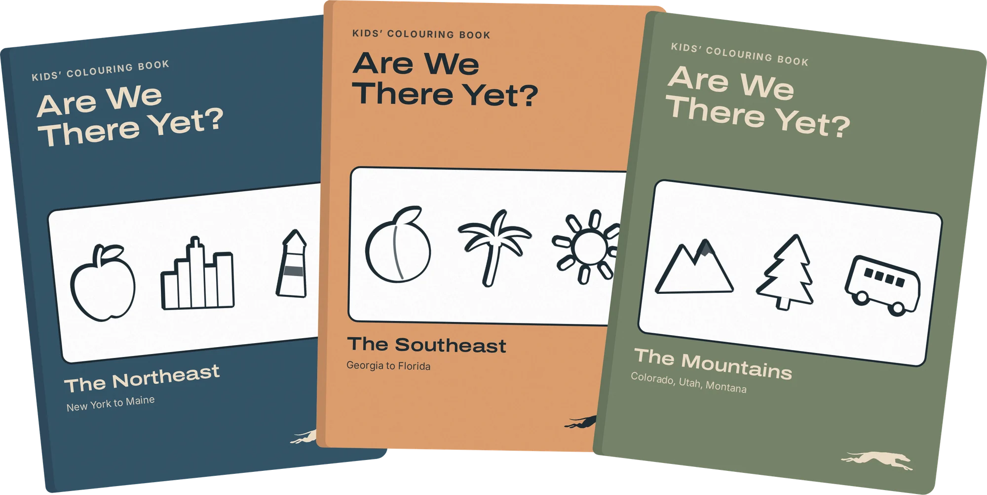
- Colouring books
- Road Trip Crayons
- Bus window decal
- Sticker sheet
Before you leave
On the bus
Something to keep
Takeaways
The line I landed on: the journey is part of the destination.
- Keep what works. Leaving the dog alone made every other change easier to trust.
- Specific beats pretty. Leaf shadows were nice. Peaches, boots and palm trees tell you where you are.
- Critique is a design tool. The paper ticket, the photo overlays, the brand voice and the colouring books all came out of feedback.
Next, I’d put the printed ticket and the Window Seat Guide in front of real riders at a station, to see whether the road-trip story lands with people who just need a cheap seat.